
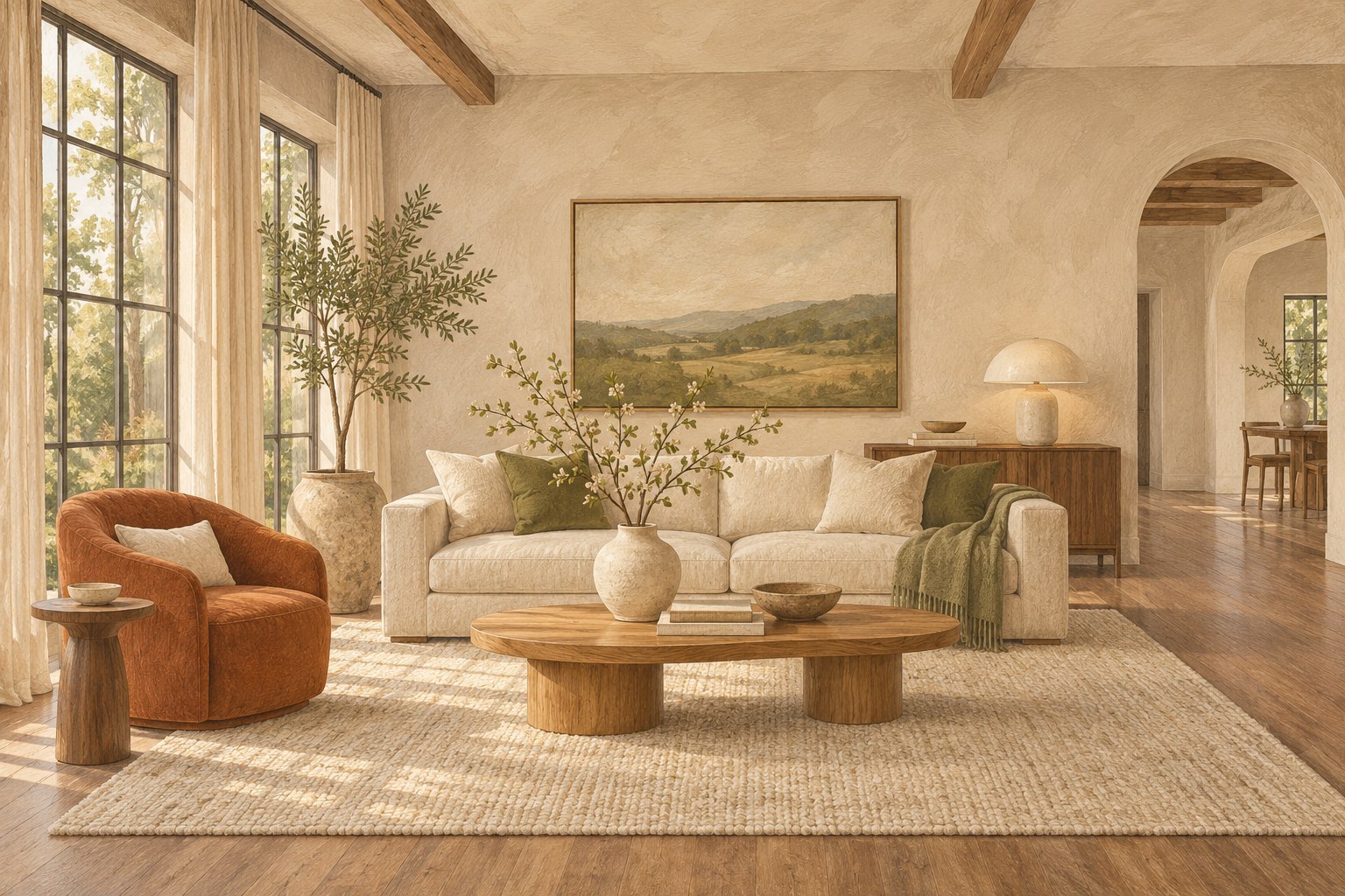
Use the warmth of a trend without imposing a personal renovation on a property about to sell.
Read a design signal in its proper context
A design trend can provide a fresh way to look at a room, but it is not a forecast of what a particular buyer will pay for a property. Houzz's U.S. fall design report, published September 2, 2026, describes professional interest in warmer materials and layered interiors. The report is design context. It should not be turned into a claim that every seller needs a warm palette or a renovation before listing.
For a home about to be marketed, the useful question is narrower: could a restrained adjustment make the existing space feel more coherent and easier to understand? That might involve moving an object, simplifying textiles or choosing a compatible accent. It does not automatically require changing a floor, replacing cabinetry or purchasing a complete collection of new furniture.
This guide offers original editorial ways to test those decisions. It separates an aesthetic idea from a property-specific business case and favours changes that can be evaluated in the actual room. Keep the source date and U.S. scope visible when referring to the trend. Then return to the home's light, fixed finishes, scale and practical constraints. A current idea earns its place when it solves a real presentation problem; its popularity alone is not enough.
Map the fixed materials before choosing accents
Begin with the elements that will remain through the listing: floor, cabinetry, worktop, tile, stone, doors and substantial built-in features. Look at them together in the actual room. Photographs and paint names are useful references, but neither guarantees that a colour will behave as expected beside an existing surface. The starting palette is the property itself, not an inspiration image.
Write a short material description without immediately judging it. A floor may be pale and slightly cool, the cabinetry medium-toned, and the wall a warm off-white. This description helps you see relationships. If every existing element is described simply as beige or grey, it becomes difficult to explain why an introduced textile feels disconnected. A modest sample board can organise observations, provided it is checked against the room rather than treated as a replacement for it.
Separate what must be respected from what can be edited. A movable rug, artwork or throw offers flexibility; a fixed stone surface may not. When a proposed accent clashes, first change the accent instead of assuming the property needs a permanent intervention. This sequence keeps a trend-led decision proportionate. It also makes the reasoning easier to discuss with a seller who needs to understand what the change fixes before agreeing to spend.
Observe warmth through the room’s changing light
A room's appearance changes across the day and under its usual lamps. Inspect the existing palette in the conditions likely to be used for photography and viewings. Notice whether direct sun strengthens a colour, a shaded corner makes it appear duller, or mixed lamps create a patchwork across surfaces. These are observations to share with the stager and photographer, not reasons to promise a universal lighting solution.
Test proposed textiles or paint samples in more than one position. A cushion that looks compatible beside the window may feel unrelated on the sofa at the rear of the room. If painting is genuinely under consideration, use an appropriate sample and allow for the manufacturer's instructions before judging the result. Do not commit to a large change based solely on a small screen image.
Check practical lighting first. Replace suitable failed bulbs within the fitting's requirements, clean accessible fittings safely and seek qualified help for faults. Keep cables out of routes. A palette problem can sometimes be a maintenance or lighting-consistency problem, and buying warmer accessories will not resolve it. The aim is to see the room honestly under its real conditions, then decide whether an aesthetic adjustment still serves a useful purpose.
Build a small material family rather than a shopping theme
A coherent room can use variation without making every object compete for attention. Choose a limited material family that already relates to the property, then repeat it selectively. For example, a room with visible wood might be supported by a plain woven textile and a matte ceramic object. This is an illustrative composition approach, not a prescribed package or a claim that a particular material improves sale results.
Focus on the relationship between surfaces. A very shiny new object may become the strongest feature in an otherwise quiet room. A dense pattern may draw attention away from a window or fireplace. Ask which element should lead and which should support it. If the styling requires a long explanation to justify every item, simplify the arrangement and look again from the doorway.
Avoid treating warm as a requirement to make everything brown. A restrained palette may include pale surfaces, muted colour and a small contrasting accent. The decision should reflect the existing architecture and light. Use texture where it adds readable depth, but leave useful surfaces available and keep circulation clear. A material family is a way to organise choices; it should reduce the number of decisions, not become a reason to buy matching objects for every available corner.
Translate layered style without creating visual clutter
Layering can mean several things: different textile textures, furniture from different periods, or objects with varied shapes and heights. In a property presentation, those layers still need a hierarchy. The viewer should understand the room before they are asked to appreciate its collection. Begin with the main furniture arrangement and the architectural feature, then add only what supports that reading.
Use a physical editing test. Remove the small objects from one surface, inspect the room and return a few pieces. Stop when the grouping contributes to the composition without interrupting the surface's use. Repeat the test from the doorway and the likely photographic view. A grouping can look attractive close up while becoming a distracting patch of shapes at room scale.
Consider maintenance between viewings. A delicate arrangement that takes a long time to reconstruct may not suit an occupied home. Keep the important layers easy to reset and identify which positions are flexible. If a seller already owns meaningful objects, select a few appropriate pieces with their permission rather than inventing an anonymous display. The objective is not to erase the home's character; it is to prevent competing objects from obscuring the space a visitor needs to understand.
Distinguish resale preparation from a personal design project
A homeowner decorating for many years can reasonably prioritise a highly personal preference. A seller preparing for a listing has a different timeframe and audience. Mixing those purposes can lead to spending that neither serves the household for long nor solves a presentation problem. Before approving a trend-related change, ask whether it belongs to the future life of the home or the short listing period.
For short-term preparation, favour actions with a clear immediate purpose. Editing an overfilled shelf can reveal its proportions. Repositioning a rug can connect furniture that currently feels disconnected. Introducing one compatible textile may resolve an abrupt colour relationship. Each action should be explainable without relying on the phrase on trend.
When a proposal involves substantial permanent work, pause for a separate decision with the agent and relevant professional. Ask about the actual condition being addressed, available time, disruption and local evidence. Do not infer that a design signal provides a financial return case. A seller may still choose a personal improvement for other reasons, but the record should state that purpose honestly. Keeping these two kinds of decision distinct helps a styling brief remain focused and prevents an editorial trend article from becoming an unsupported renovation recommendation.
Try the reversible version first
A reversible test is a practical way to find out whether an idea suits the room. Rearrange existing objects, borrow an appropriate textile with permission or compare a small material sample before placing a large order. Photograph the trial from the same viewpoint as the current arrangement, using comparable conditions where practical. Evaluate the difference in room clarity rather than simply rewarding the version that looks more fashionable.
Ask three specific questions. Does the new element relate to the fixed finishes? Does it help the important furniture or architectural feature read more clearly? Can the household or installation team maintain it without extra difficulty? If the answer is unclear, remove the item and inspect the room again. A test that leads to doing less can be successful.
Record what happens to an introduced item after the listing period. An existing household object may return to its original room, a borrowed item needs a return arrangement, and a purchase needs a destination. This does not make every small accessory a major financial exercise. It simply keeps the plan grounded in actual use. A trend should offer a lens for making a decision, not create a collection of objects that nobody needs once the photographs are complete.
A hypothetical room with cool floors and warm furniture
Consider an illustrative living room with a pale cool-toned floor, medium wood furniture and a large light sofa. The seller has seen warm interior imagery and wonders whether the floor must be replaced before listing. This is a hypothetical design discussion, not a real project or a claim about market outcomes. The first step is to identify the presentation issue rather than accept the proposed solution.
During the room review, the furniture arrangement already works, but several small rugs and brightly patterned cushions divide the view. The team tests removing the small rugs and using one appropriately sized, quieter rug that relates to both the floor and furniture. They reduce the competing cushion patterns and introduce a restrained texture using items already available. The fixed floor remains visible and accurately represented.
The comparison photographs show a more coherent arrangement, but the team does not claim that the edit will increase the sale price. They record the observable change: fewer competing areas and a clearer seating group. The seller can then decide whether the limited presentation work is worthwhile on its own terms. The example demonstrates a useful discipline: test the smallest relevant adjustment before assuming that an aesthetic mismatch requires replacing a permanent feature.
Review the palette at room scale and image scale
A material sample is small; a room is a composition; a listing card may be smaller than either. Check all three levels before approving the final arrangement. At room scale, look for relationships between the main furniture, floor and architecture. At photograph scale, inspect whether shadows, reflections or overlapping objects make the palette harder to read. At thumbnail scale, ask whether the image still communicates the space rather than a dense collection of details.
Review phone crops deliberately. A warm accent chair that balances a wide composition may disappear from a narrow crop, leaving the remaining colour story uneven. That does not mean the room needs another accessory; the photographer or editor may need a more suitable image selection. Keep disclosure labels intact wherever an image is an illustration or contains virtual staging.
Do not use editing to solve a physical material relationship by changing the property. A permanent floor should remain recognisable, and an image should not imply finishes that do not exist. If a rendering explores a possible palette, label it as a concept and keep it separate from present-condition photographs. Good presentation depends on continuity between the room, its image and the visitor's experience. Colour is part of that continuity, not permission to invent a different home.
Create a restrained purchasing brief
If the reversible tests identify a genuine need, write a purchasing or rental brief that describes the function and constraints. Instead of request warm accessories, specify the relevant size, material relationship, durability, delivery timing and intended position. Give the provider enough information to propose alternatives without turning the brief into a catalogue of objects chosen only from an inspiration image.
Keep priorities visible. A correctly scaled rug may matter more to the room's composition than several decorative pieces. A missing practical lamp may deserve attention before an additional artwork. Where quotes are needed, obtain them from actual local providers and include the full relevant scope. Do not use invented example prices to make a decision feel more concrete.
Set a stopping rule before shopping begins. The room should communicate its purpose, maintain a usable route and present its fixed features coherently. Once those goals are met, further objects need a specific justification. This prevents the design idea from expanding merely because more products can be found in the same palette. A restrained brief is also easier to install, maintain and remove. It keeps the trend in service of the property rather than letting the property become a backdrop for the trend.
Keep the editorial promise modest and useful
A trend article should help readers make a considered choice without implying that an aesthetic is compulsory or universally profitable. When discussing a current design source, include its date, geography and nature. Distinguish the source's observations from the practical recommendations developed here. If a later report changes the conversation, update the context rather than silently treating an older prediction as an established fact.
For the actual property, record the selected change, the reason for it and the evidence used to judge it. That evidence may be a room review, a measured layout, a sample comparison or the responsible professional's local observations. It does not need to be a dramatic percentage. Clear descriptions of what changed are often more useful than broad claims about transformation.
The final check is simple: does the room look coherent, remain usable and represent the property honestly? Warmth can come from a restrained material choice, a clearer arrangement or existing character that was previously buried beneath clutter. It does not require a complete makeover. By treating design signals as prompts for judgment rather than instructions to purchase, homeowners and stagers can use current ideas while keeping the brief proportionate to the home and its next chapter.
These are original editorial recommendations, not a service quote or a promise of sale results. Background context: Houzz 2026 U.S. Fall Design Trends Report. U.S. sources are identified as context; local market and listing rules should be checked with the responsible professional.
Houzz 2026 U.S. Fall Design Trends Report, September 2, 2026
How we use sources and illustrations ↗