
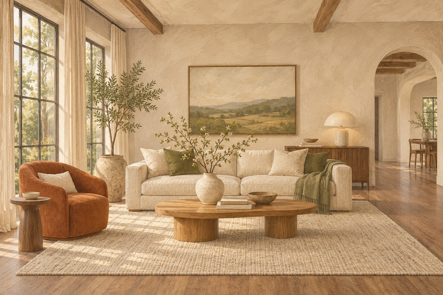
Use measured furniture and visible circulation to show the space honestly.
Start with a measured understanding of the room
A small living room benefits from a clear explanation of what fits and how it works. Begin with measurements of the usable walls, door openings and fixed features. Mark radiators, cupboards, windows, changes in level and the main route through the space. A room described by its total floor area can still have very different furnishing possibilities depending on those details. Sketching them makes it easier to compare arrangements before buying or renting anything.
Identify the room’s essential activity. In one home it may be conversation; in another it may be a shared space for reading and television. Do not assume that a modest room must demonstrate every possible activity. A sofa, dining set, desk and exercise station can make the plan harder to understand if none has enough space to operate. Choose the primary use that matches the property and the actual household, then decide whether a secondary use can be shown plausibly.
Use measurements to test a proposal, not to promise that every visitor will experience the room in the same way. Individual access and comfort needs vary, and any applicable requirements should be checked appropriately. The original editorial approach here is practical: make the space legible, keep it truthful and avoid furniture that creates an obstacle merely to complete a decorative composition. A small room does not need to masquerade as a large room. It needs a coherent arrangement that a viewer can understand from the doorway and experience in person.
Put circulation on the plan before seating
Trace the route from the entrance to any adjoining room, garden door or frequently used storage. If the living room is a passage as well as a destination, acknowledge that in the layout. Furniture should define the activity area without forcing the main route through its most awkward point. A coffee table placed exactly in the centre of a photograph may be less useful than one offset to keep the route clear.
Try the arrangement physically before settling it. Walk through while another person is seated, carrying a normal bag or coat if that reflects an ordinary visit. Notice where you turn sideways, brush a furniture edge or need someone else to move. These observations are more informative than judging from an empty plan alone. Remove or relocate the least necessary piece before assuming that the whole seating group must be replaced.
Be wary of a temporary photographic arrangement that cannot function during viewings. Moving a chair into a doorway for an attractive image may create a misleading picture of how the room works. The same applies to storing the coffee table elsewhere only while the photographer is present if it is essential to the room’s usual setup. Choose a plan that can remain in place or be reset honestly. Check the route again after lighting and accessories are added, since a floor lamp, basket or trailing cable can quietly undo a successful furniture decision.
Choose the right main seat, not the smallest one
The principal sofa usually has a strong effect on a compact room, but width is only one part of that effect. Look at depth, arm thickness, back height and the space needed to use it. A compact sofa with bulky arms can offer less practical seating than a slightly wider, simpler design. A deep piece may leave too little room for circulation even when its overall length appears suitable on the plan.
Assess what the household already owns before replacing it. Try a different wall, remove an adjacent piece or change the angle of the secondary chair. If replacement or rental is being considered, obtain the actual dimensions and check the delivery route. Do not choose doll-sized furniture merely to exaggerate the floor area in a listing image. The arrangement should demonstrate an ordinary use that remains plausible when someone sits down.
Consider visual weight separately from physical size. A high-backed dark sofa immediately beside the entrance can block the view into the room, while a lower piece elsewhere may reveal more of the space. Visible legs or a simple profile may help a particular composition, but they are not universal rules. Judge the real piece against the room’s architecture and needs. The best choice is the one that supports the intended activity without crowding the route or hiding the features the viewer needs to see. A measured trial is more reliable than choosing from a product photograph alone.
Give every secondary piece a specific job
List the purpose of each item beyond the main seat. A chair may complete the conversation group, a side table may provide a useful surface and a cabinet may supply necessary storage. If an item has no clear role, test the room without it. This is a more useful editing method than removing objects randomly until the space looks sparse. It also helps preserve the pieces that make the room genuinely functional.
Avoid introducing multiple occasional tables when one well-placed surface would do. In a very compact arrangement, a small side table may be more practical than a large central coffee table, but the choice depends on how the room is used. Test reach, movement and stability with the actual furniture. Do not substitute a fragile decorative object for a surface that someone is likely to use. Keep product instructions and safety considerations part of the selection.
Multifunctional furniture can be helpful when its second function is usable. A storage ottoman needs space to open; a folding desk needs somewhere for its chair; a nesting table needs a sensible location when separated. Demonstrate the relevant function rather than implying that a label solves every space problem. A small room becomes easier to read when the furniture has a few clear relationships. Too many clever pieces can create a plan that looks efficient in a shopping list but requires constant rearrangement in daily life and during viewings.
Use the rug to connect a group, not fill a formula
A rug can help describe a seating area, particularly in an open room, but its usefulness depends on placement, size and the surrounding furniture. Begin with the group you want to connect rather than a universal instruction about where every furniture leg must sit. Compare the rug’s edges with the route through the room and any door opening. It should not create a trip problem or interfere with normal operation of a door.
If the existing rug reads as a small isolated patch, try repositioning it in relation to the main seating before buying another. Photograph the alternatives from the doorway. Look at whether the room feels divided into unrelated pieces or whether the rug helps the seats read as one activity area. A large pattern may be attractive, but in some arrangements it competes with upholstery, artwork and a strong floor finish. Choose a calmer relationship when those elements already provide sufficient detail.
Follow suitable product and floor guidance for placement and underlay where relevant. Do not conceal damaged flooring or imply that an area is in a different condition from reality. If removing the rug reveals a condition issue, discuss that issue through the appropriate property process. The styling question and the condition question need separate answers. A rug is one tool for explaining a room, not an obligation. A clear floor can be the better choice when the architecture, furniture and actual route already define the space convincingly.
Keep colour and materials coherent without making everything pale
A compact room does not have to be entirely white or beige to feel understandable. Start with the fixed finishes and the main furniture, then choose a small set of supporting colours and materials. The goal is a coherent visual field rather than a promise that a certain paint colour creates extra space. A strong existing floor or fireplace may need a quieter textile layer; a simple room may accommodate one more expressive object without becoming difficult to read.
Use repetition to connect separate elements. A wood tone echoed in a picture frame or a muted colour repeated in a cushion can make the scheme feel intentional. Avoid matching every object exactly, which may create a display-set appearance and encourage unnecessary purchases. Look at samples beside the actual finishes and under the light used during viewings. A colour that seems neutral in a shop or on a screen may behave differently in the room.
Before repainting, ask what problem the change is meant to solve. Cleaning, removing a busy artwork group or simplifying textiles might address the distraction more directly. If painting is appropriate, prepare and carry out the work properly, following product guidance and any relevant professional advice. Do not choose a large permanent project solely because a trend article recommends a palette. Staging decisions should be tied to the property’s presentation needs, the household’s capacity and the actual listing timetable. The most useful edit may involve fewer competing materials rather than a completely new colour scheme.
Make walls and windows reveal the architecture
Look at the walls from the entrance and identify what they contribute. A large artwork can anchor a seating group, while many small unrelated pieces can scatter attention. Neither size is automatically correct. Test the relationship to the furniture, the wall shape and the viewing height, then review it through a reference photograph. Leave some wall area quiet so that architectural lines and room boundaries remain visible.
Use mirrors for a specific reason, not as an automatic small-room trick. Check what the mirror reflects from several positions. It may reveal a useful window or simply double a cluttered entrance and expose personal details. Do not place it where the reflection implies a window, doorway or space that a visitor could misunderstand. Make sure mounting and placement follow appropriate product and safety guidance, especially in a compact route where people may brush past it.
Treat windows as genuine features rather than accessory shelves. Remove unnecessary obstructions, clean accessible surfaces safely and choose the agreed position of coverings for photography and visits. Preserve privacy and safety features where needed. A tall cabinet beside a window can interrupt the daylight view even when it fits on the plan, so assess the physical and visual effects together. The aim is to show the room’s actual light and proportions, not to create an illusion that only works when a covering is removed or a camera avoids the less flattering side.
Light the room without crowding the floor
Begin by checking the existing fittings and observing the room at relevant times of day. Identify where the room becomes difficult to understand and where glare distracts from its features. Replace failed bulbs only with compatible products suited to the fitting and its rating, and have electrical faults handled appropriately. A collection of decorative lamps should not be used to ignore a practical lighting problem that needs a qualified person.
Add lighting only where it serves the room’s use or presentation. A reading lamp beside a chair may make that corner legible; several floor lamps may consume the route and create cable problems. If a table lamp is used, confirm that its supporting surface remains stable and useful. Keep leads out of walking paths and do not improvise unsuitable extensions or covered cables for the sake of a photograph. The final arrangement should remain safe and plausible during ordinary use.
Review the combined light rather than each fitting in isolation. Visibly different lamp colours can create an unsettled effect, while an overly bright spot may draw attention away from the room as a whole. Share observations with the photographer and agree a natural-looking treatment of mixed light. Do not edit away fixed obstructions or fabricate a view through the window. A small room is best presented with a consistent set of images that people can recognise on arrival, including a darker viewing appointment if the listing schedule includes those times.
A hypothetical edit of a narrow living room
Imagine a narrow living room with a doorway at one end and a garden door at the other. This is an illustrative scenario rather than a client case. The room contains a deep sofa, two armchairs, a central table and a storage unit. The main problem is not a lack of decoration; the route to the garden cuts through the seating group, and one chair hides part of the window. The brief prioritises a clear conversation area and straightforward access outdoors.
The first trial removes one armchair and moves the remaining chair to a position that acknowledges the sofa without blocking the window. The central table is tested against a smaller existing side table, not replaced immediately. The storage unit remains because it has a necessary household role, but its top is edited and the plan is checked to ensure its doors work. A reference photograph helps compare the room before and after the arrangement change.
The team then reviews lighting and one coherent textile combination. No imaginary extra floor area has been created. Instead, the actual route and useful seating are easier to understand. If the household needs the removed chair for a specific daily purpose, the plan must account for that rather than treating storage elsewhere as free and effortless. The result is judged through function, visibility and truthful images. It is not evidence that the home will sell faster or that this exact furniture formula works in every narrow room.
Review the complete room from three positions
Finish by inspecting the room from the entrance, from a seated position and from the exit or adjoining space. Each view answers a different question. The entrance should communicate purpose and proportion. The seated position should make the furniture relationships plausible. The exit view should reveal whether the arrangement still works when someone turns around. A composition that succeeds from only one camera angle needs another pass before it becomes a reliable staging plan.
Check the small details that can undermine an otherwise clear layout: a door that catches a rug, a chair that cannot move, a cable that crosses the route, reflections that reveal private material, or a surface filled with objects despite having a practical role. Resolve them physically where possible. Keep condition matters separate and involve the responsible professional when necessary. A decorative adjustment should never be used to disguise a property defect or imply a feature that is not there.
Save a measured sketch and a few final reference images so the room can be reset before viewings. Keep the routine short: restore the main furniture positions, clear daily belongings to their proper storage, check light and coverings, and verify the route. Stop shopping once the space communicates its actual purpose. The purpose of staging a small room is not to make it look impossibly large. It is to show a real, usable space with enough clarity that a viewer can decide whether it suits their needs.
These are original editorial recommendations, not a service quote or a promise of sale results. Background context: NAR consumer guide to staging a house for sale. U.S. sources are identified as context; local market and listing rules should be checked with the responsible professional.
NAR Consumer Guide: Staging Your House for a Sale — general U.S. background
How we use sources and illustrations ↗