
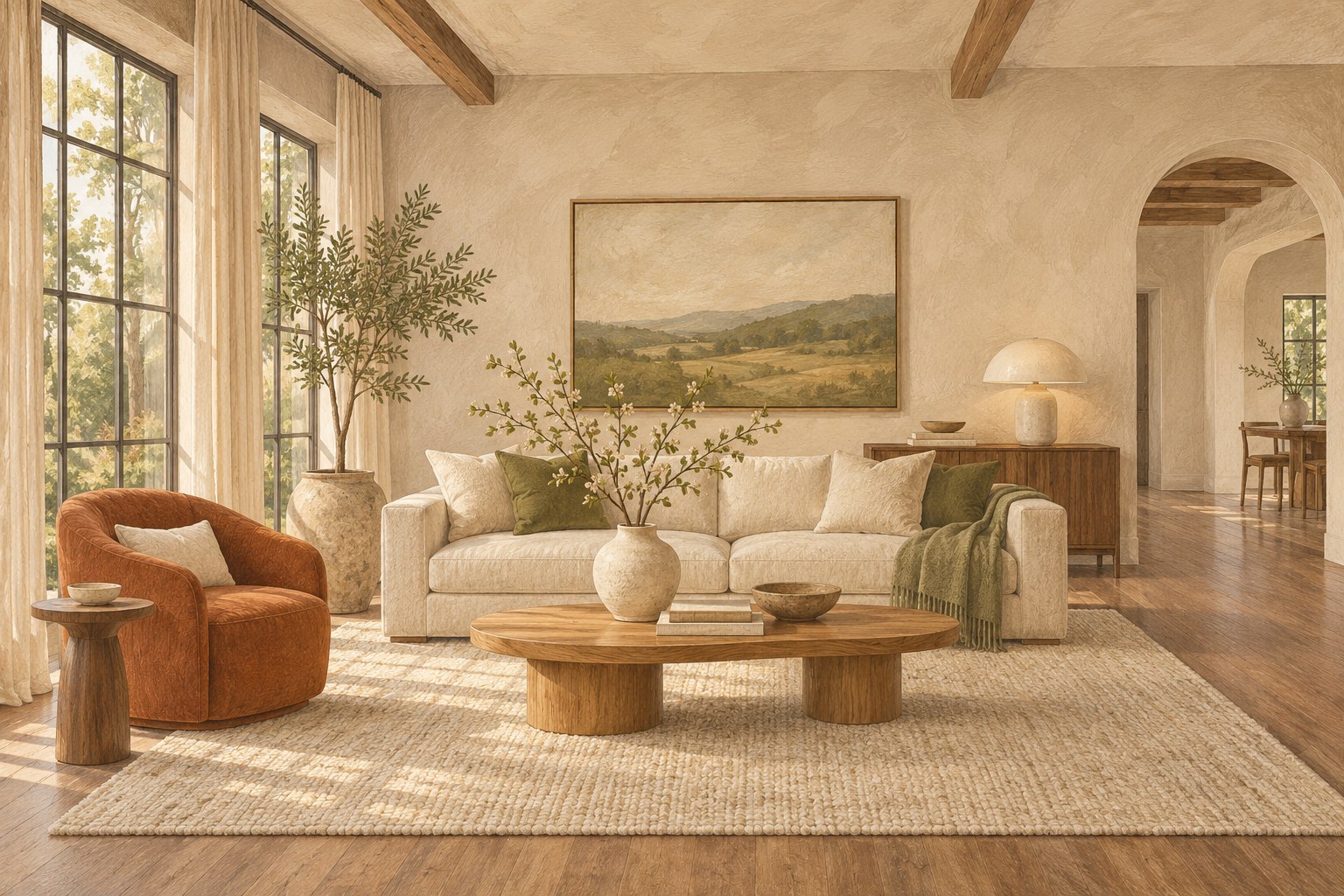
Start with a clear purpose, a natural walking route and furniture that makes the room easy to understand.
Start with the question the room must answer
A room becomes easier to understand when its main purpose is visible before its accessories are noticed. For staging, begin with a simple question: what should someone be able to do here? Sit and talk, eat comfortably, work at a desk, or sleep with usable storage are useful answers. A list of objects is not an answer. A room containing a console, armchair, desk and exercise equipment may have enough furniture yet still leave a visitor unsure how it works. Choose a primary use that fits the room’s actual position, dimensions and relationship to the rest of the home.
Write that use at the top of a one-page room brief. Under it, list the architectural features to reveal, the necessary furniture and the objects that currently compete with the intended use. This gives every later decision a test. A chair may stay because it completes a conversation group; a display cabinet may leave because it blocks a natural route. Neither choice requires a judgment about the owner’s taste.
Do not invent a purpose the property cannot plausibly support. A tiny landing should not be presented as a fully functional office if a chair cannot be used there. Likewise, a windowless storage space should not be labelled a bedroom without the responsible professional establishing that the designation is appropriate. The editorial principle is clarity: show the real space at its most understandable, without claiming a different property.
Map the fixed features before moving furniture
Draw a simple plan, even if a formal floor plan already exists. Mark door openings and their swing, windows, built-in cupboards, radiators, sockets, fixed lighting and changes in floor level. Note which features need access during an ordinary visit. A plan does not have to be beautiful; it must help you avoid solving one problem by creating another. Put dimensions beside the walls you will actually furnish, rather than relying on an estimate taken from a photograph.
Now identify the strongest genuine feature. It might be a fireplace, a garden view or a long, uninterrupted wall. That feature can guide the arrangement, but it does not have to dictate a symmetrical composition. A room with several doors may work better with an offset sofa than a perfectly centred one. Keep the distinction between a visual focal point and an operating feature: a fireplace shown attractively should not be implied to work if its condition or status is unknown.
Make a second pass for things that a photograph can hide. Can the wardrobe open fully? Is a floor vent covered? Does the chosen chair block a switch? These details matter because staging is experienced physically as well as visually. Record any unresolved condition issue separately and discuss it with the appropriate person. Moving a table in front of damage is not the same as resolving the damage. A clear drawing helps make that distinction visible to the team.
Draw the walking route first
Before placing the sofa, trace how a visitor enters, crosses and leaves the room. Include the route to a balcony, cupboard or adjacent room where relevant. Then test that path physically. Walk it while carrying a normal bag; ask another adult to remain seated while you pass. The point is to observe where movement becomes awkward, not to invent a universal clearance number for every household or property. Accessibility needs and local requirements should be assessed appropriately rather than assumed from a styling plan.
A common problem is a route that runs through the middle of a furniture group. Someone entering must squeeze between a coffee table and the knees of a seated person, even though another part of the room is empty. Try relocating the table, changing the orientation of one chair or removing an occasional piece before replacing the main furniture. Small adjustments often make the intended use clearer because the room stops asking visitors to negotiate obstacles.
Do not push every item against a wall automatically. That can leave an unhelpful central void while the functional relationships become stretched. Conversely, pulling furniture into the room is not automatically better. Compare two measured arrangements and choose the one that preserves a sensible route and a coherent activity area. Once the route works, mark it on the plan and check it again after accessories, lamps and cables have been added. The final layer should not undo the first decision.
Choose furniture by role, then by appearance
Make an inventory of the furniture already available. Give each piece a job: principal seating, secondary seating, useful surface, storage or lighting. If two pieces have the same job, ask whether both are necessary. This makes editing more specific than simply removing a set percentage of belongings. A room with few objects can still be badly organised, while a room with several purposeful pieces can be easy to read.
Assess scale with measurements and a physical trial. A sofa’s width alone does not explain its effect: depth, arm shape, back height and placement all matter. A dark, high-backed chair directly in the doorway view may interrupt the room more than a larger, lower piece farther away. If you are considering rented furniture, compare its actual dimensions with the plan and the delivery route before approving it. Do not use undersized furniture simply to make the room appear larger in a photograph.
Keep one or two useful relationships especially clear. A seat should relate to a surface where appropriate; a desk should allow a chair to be pulled out; a dining group should demonstrate a plausible meal setting. Those relationships help a viewer understand how the home could function. They also provide a stopping rule for shopping. If the existing pieces already explain the room, the next purchase needs a specific reason beyond matching a mood board or filling a bare corner.
Edit visual noise without erasing character
After the furniture works, look at the smaller visual signals. Several tiny objects, scattered colours and unrelated patterns can compete for attention even when they occupy little floor space. Begin by clearing one surface completely. Return the object that best supports the room’s purpose, then decide whether anything else improves the composition. Leaving an open area is a deliberate choice; it demonstrates that the surface can still be used.
Choose a small material and colour vocabulary from what is already fixed. A wood floor, a stone surround or a strong window frame offers a starting point. Textiles and accessories can connect those elements without making everything identical. Repetition is useful when it creates a relationship, not when every cushion, vase and book is the same colour. Review the room in daylight before committing to new paint or fabric, since samples can read differently beside the actual finishes.
Personal objects deserve a thoughtful decision rather than an automatic ban. Some character can make a home feel considered, but private documents, identifiable family images and highly valuable pieces may be better secured before public viewings. Let the household make that decision with the agent. Avoid moving possessions into a cupboard that a viewer is likely to open or into an unsafe storage arrangement. Editing should reduce both distraction and practical stress, rather than transfer the clutter to a place where it creates another problem.
Make light explain the room
Observe how the room looks at the times it will be photographed and visited. Note which areas receive daylight, where glare occurs and which corners become difficult to understand. Clean accessible glazing safely, open suitable coverings and remove objects that unnecessarily block a window. Keep privacy and safety considerations in the decision; a bright photograph is not a reason to remove a feature the household needs without agreement.
Check the lighting that is already installed before adding decorative lamps. Replace compatible failed bulbs, follow fitting ratings and have faults handled by an appropriate professional. A mixture of visibly different lamp colours can make the room feel unsettled, so review the combination in person. If an additional lamp helps reveal a reading area, place it where it can be used with a safe cable route. A cord across the main path is not a reasonable trade for a better composition.
Coordinate with the photographer rather than trying to prescribe a technical exposure solution. Explain the room’s important features, the time when it looks most legible and any unusual controls. Review the resulting image for accuracy, especially window views and permanent shadows or obstructions. The aim is a natural representation that a visitor recognises. A room that looks inviting only after substantial changes to its fixed features has not yet been explained honestly by the photograph.
Use the doorway photograph as a diagnostic
Take a simple reference image from the usual entrance at a realistic height. This is a working photograph, not the finished listing image. Look at it on a small screen as well as a larger one. Does the first object dominate unnecessarily? Can you understand where the room ends? Is an important feature hidden behind a chair back? The camera can reveal an arrangement that felt acceptable while standing in the middle of the room but reads poorly from the threshold.
Change one thing at a time and photograph again. Removing a side table, rotating an armchair or moving a rug may answer the problem more directly than adding decoration. Keep the earlier images until the comparison is complete; otherwise you may mistake a different composition for an improved one. Ask someone unfamiliar with the plan to describe the room’s purpose from the image. Their hesitation can identify an unresolved choice that the person doing the staging has stopped noticing.
Check reflections, cables, personal details and the edges of the frame. Do not solve those issues by cropping away information a buyer needs about the room’s size or access. Ask the photographer for a balanced set of views, including a relationship to adjoining spaces where useful. A strong hero image is helpful, but the full set should still tell a consistent story. The room must remain understandable when a visitor turns away from the favourite camera angle.
A hypothetical room edit, step by step
Imagine a living room with a sofa, two armchairs, two side tables, a narrow desk and a tall display unit. This is an illustrative scenario, not a client case or a sale claim. The garden doors are the strongest feature, but the display unit partly blocks the view and the desk makes the route to those doors awkward. The room brief says its main job is conversation with access to the garden. That brief gives the team a practical way to decide what changes.
First, measure the available wall and the display unit. If a suitable place exists elsewhere, move it without obstructing another room; otherwise discuss temporary storage. Next, decide whether the desk has an essential daily role. If it does, test a quieter position that allows the chair to be used. If it is unused, remove it from this room. Keep the sofa and one armchair while comparing two positions for the second chair. Remove the side table that has no clear purpose after that trial.
Finally, simplify the surfaces and photograph from the entrance. The result should demonstrate a coherent seating group and a usable path to the garden, not merely fewer possessions. The owner may keep the edited arrangement for daily life or use a reference image to reset it before viewings. No part of the exercise establishes a sale-price effect; its measurable achievement is that the room’s intended function and access have become easier to understand.
Prepare a repeatable viewing setup
A completed room plan should be possible for someone else to reproduce. Photograph the final arrangement and record the few choices that matter: which curtains are open, which lamps are on, where the chair sits and which everyday objects move into secure storage. Avoid a long styling manual full of tiny adjustments that make no practical difference. The reset plan should focus on the features that explain the room and the route through it.
Give the household a specific place for the belongings removed during a reset. A labelled basket can be useful for everyday items, provided it is stored appropriately and does not contain valuables or sensitive documents left unsecured. Agree who performs the last check and how much notice is realistic. If several people share the home, a plan that depends on one person remembering every detail is fragile. A short sequence and a reference image reduce interpretation.
Review the setup after the first few viewings. If a decorative item is repeatedly knocked or a chair is constantly moved to allow access, change the arrangement rather than blaming the household. Staging is a working presentation, not a museum installation. A useful room remains plausible, comfortable enough for its real occupants and consistent with the photographs. Keep the final plan with the broader listing brief so the agent, seller and stager can resolve questions against the same version.
Know when the room is finished
Use a final review based on observable questions. Can a newcomer identify the main purpose from the doorway? Can someone move along the natural route without negotiating furniture? Are doors, storage and genuine architectural features visible and usable? Does the photograph represent the same room a visitor will encounter? Can the household reset it without an unreasonable amount of work? These questions are more useful than asking whether the room resembles a particular style of magazine image.
Separate unfinished presentation tasks from property condition decisions. A missing cushion is a styling detail; a damaged fitting or undisclosed defect needs a different response. Assign each outstanding item an owner and a sensible deadline. If it cannot be resolved before photography, discuss how it should be represented rather than concealing it. A clear record prevents a later disagreement about what the staging team was expected to address.
Stop adding objects once the room answers its main question. More layers can weaken a clear composition, increase resetting work and obscure useful surfaces. The best final decision may be to leave an attractive corner empty because it preserves light or movement. Save the photographs, plan and agreed scope, then move to the next priority room. Thoughtful staging is a sequence of specific decisions about the real property. It does not need an invented lifestyle, a universal package or a promise about what someone will pay for the home.
These are original editorial recommendations, not a service quote or a promise of sale results. Background context: NAR consumer guide to staging a house for sale. U.S. sources are identified as context; local market and listing rules should be checked with the responsible professional.
NAR Consumer Guide: Staging Your House for a Sale — general U.S. background
How we use sources and illustrations ↗